Product design
Ledger
A ground-up redesign of a fintech dashboard — turning a wall of numbers into a tool people check because they want to.
- Client
- Ledger Financial
- Role
- Lead product designer
- Year
- 2026
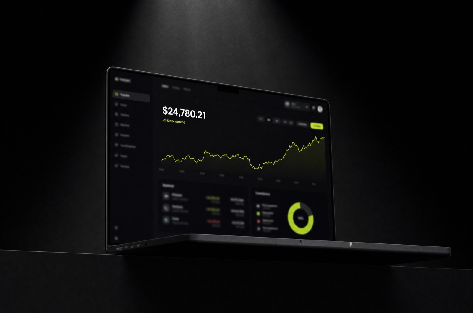
Ledger's dashboard had grown one widget at a time for six years. Every team had added their metric, nobody had removed one, and the result was a page that answered every question except the one that mattered: am I doing okay?
The one-number thesis
We rebuilt the entire product around a single daily position number. Everything else — transactions, budgets, forecasts — became supporting evidence you drill into, not competing headlines. The information didn't shrink; the hierarchy finally arrived.
The visual system followed the same rule. One accent color, used only where money moves. Neutral ink for everything at rest. Charts lost their rainbow and gained legibility.
Shipping it
I worked embedded with two engineers for four months, designing in the codebase rather than beside it. We shipped behind a flag to 5% of users, watched session length drop by a third — the good kind of drop — and rolled out to everyone in week nine.
Daily active use rose 24% in the quarter after launch, and support tickets about "finding things" fell by half.